The Brief
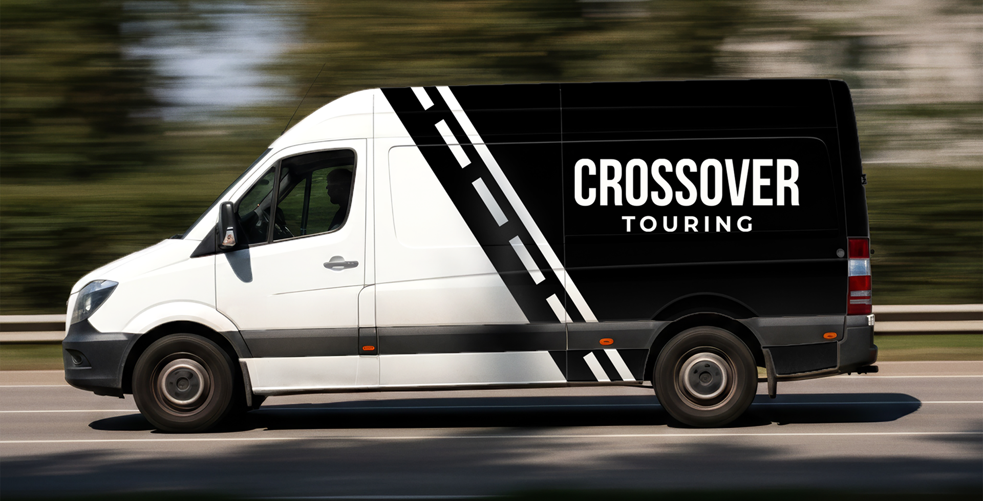
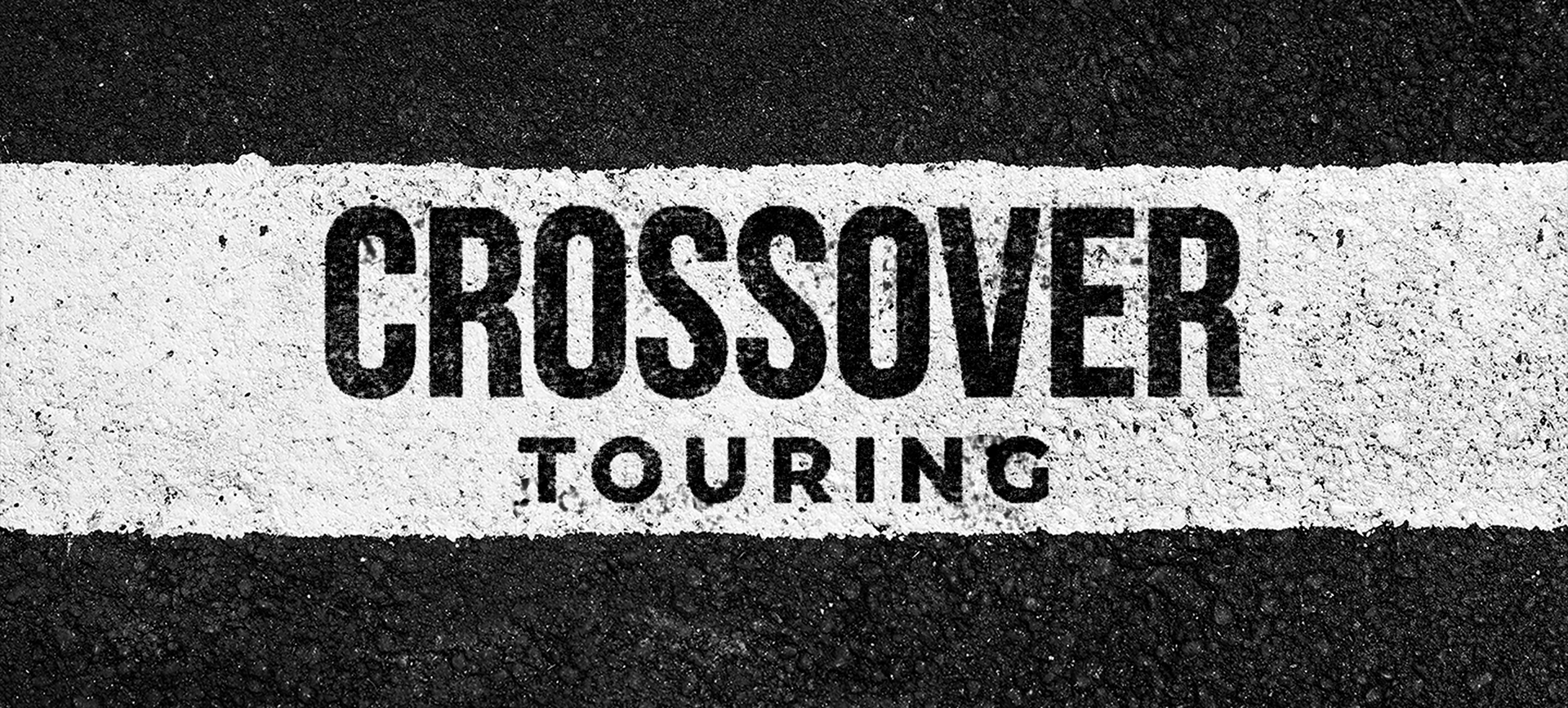
Crossover Touring did not have an established brand—only a basic text logo and a concept they liked: a circle with road lines inside. My job was to turn that idea into a flexible identity that could work for everything from apparel to trade show materials, while keeping the circular road theme clear in every use.
My Role
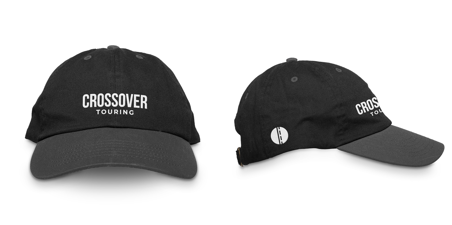
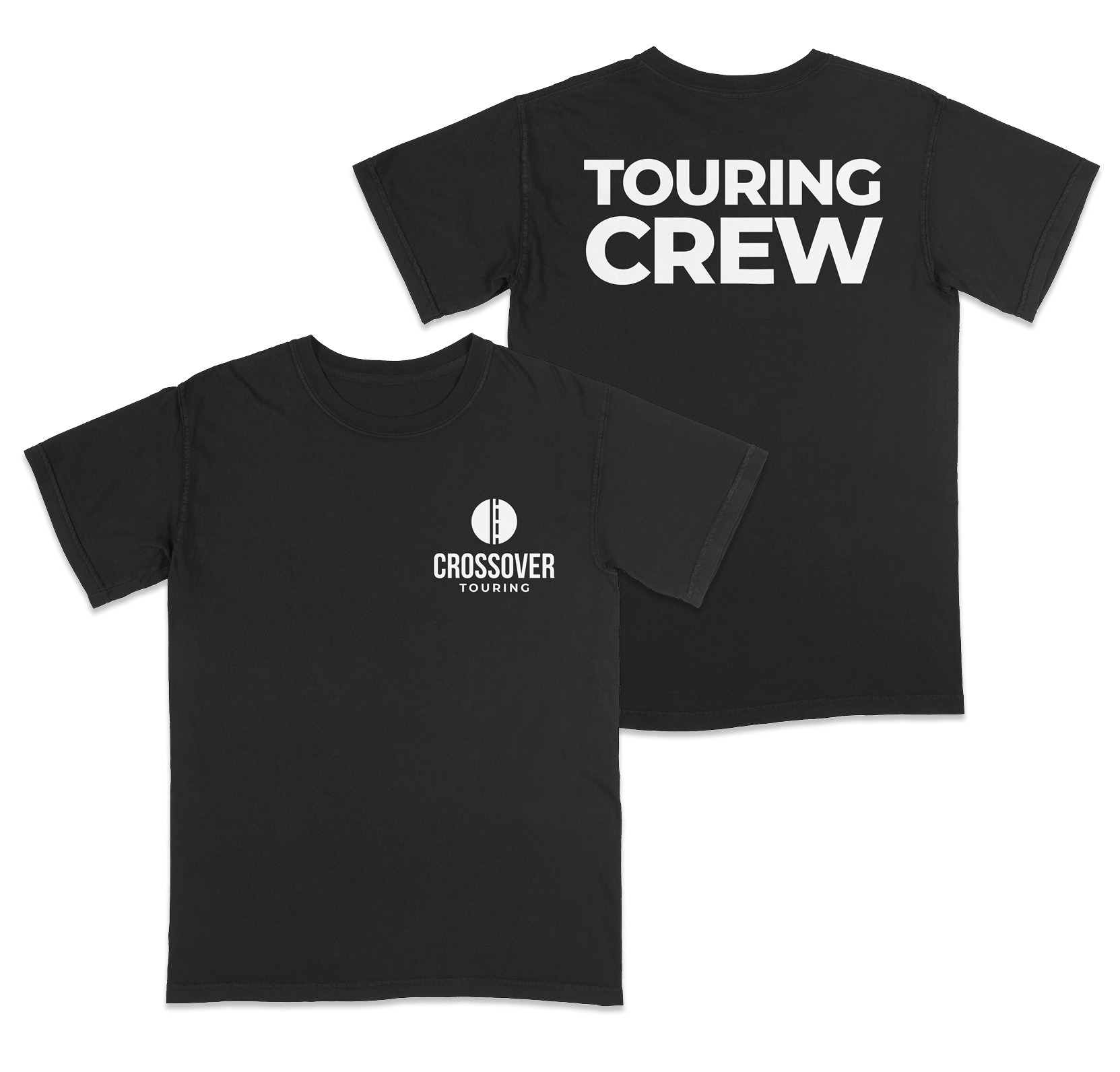
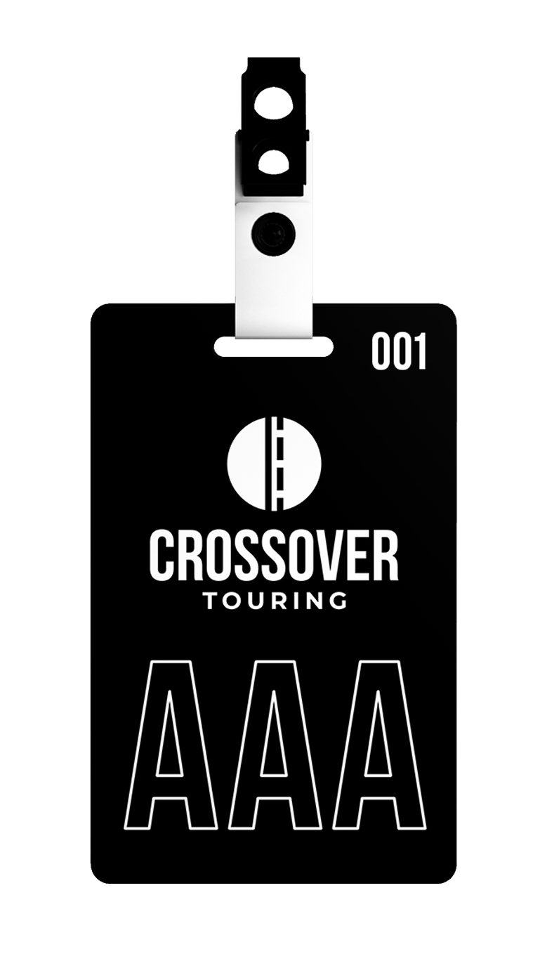
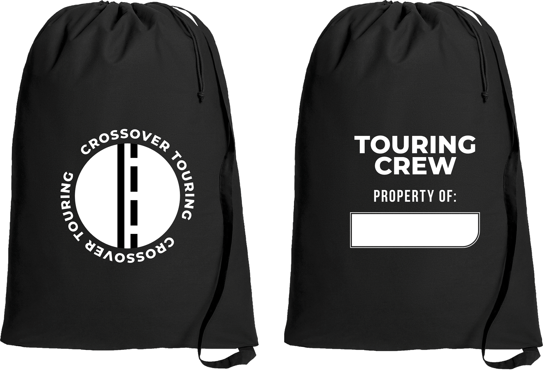
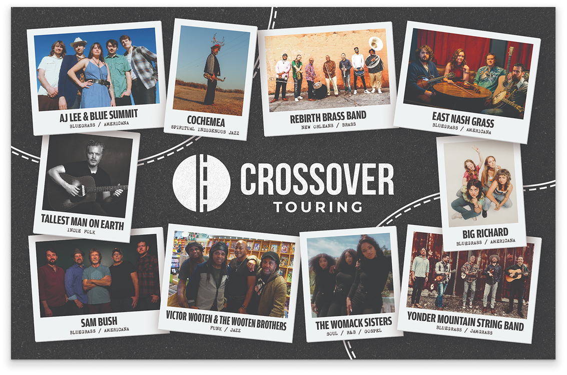
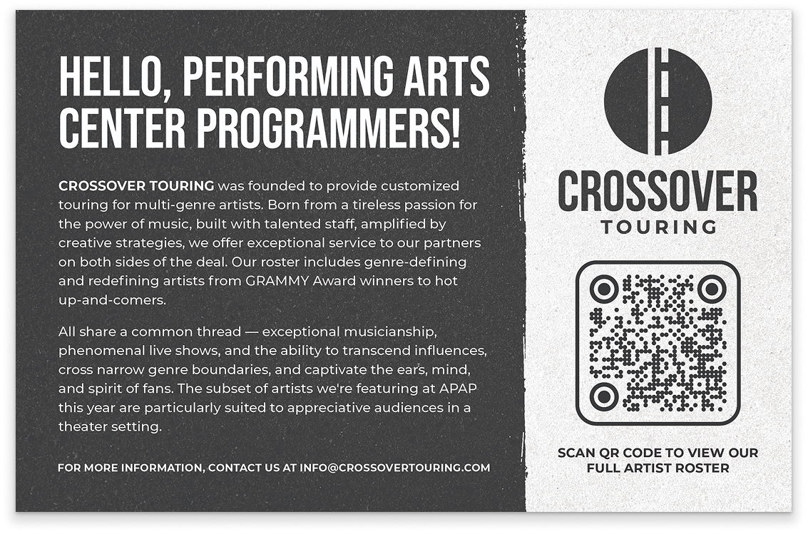
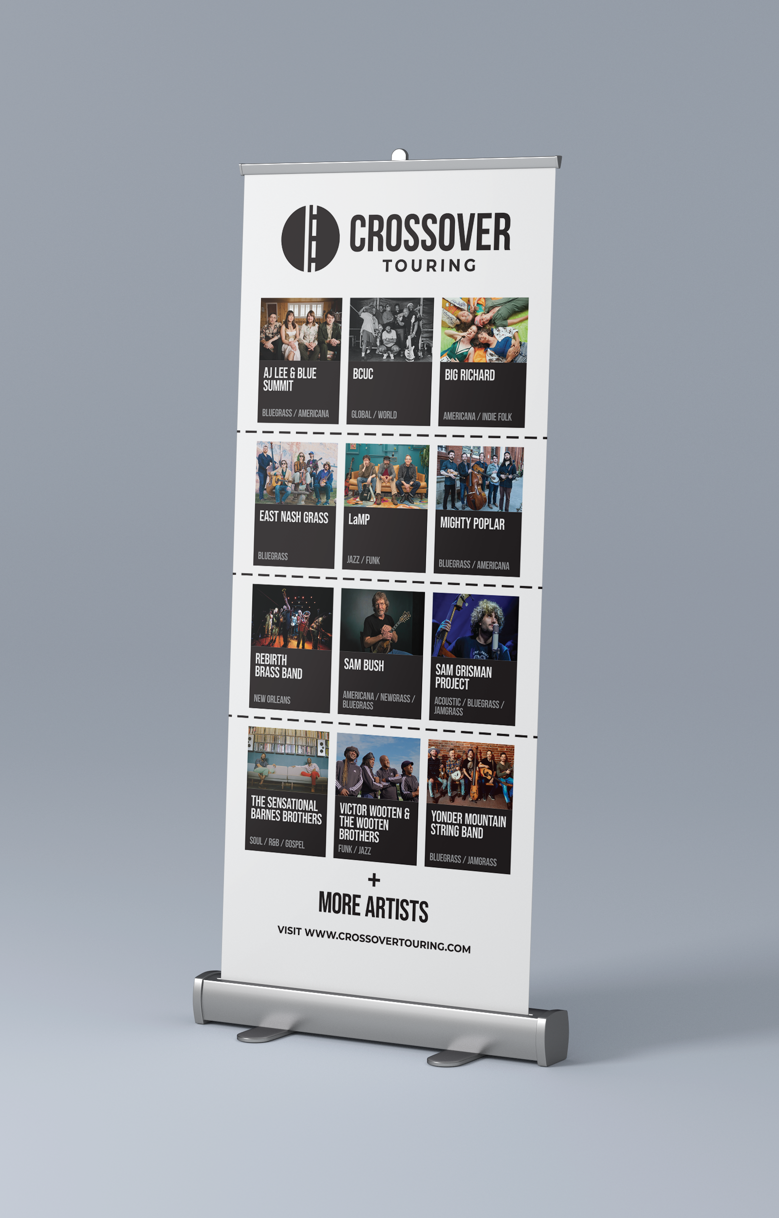
The client gave me the initial concept and name. I created the full logo system, including a refined icon, color options, and different layouts. I applied these to touring merchandise like hats, t-shirts, and laundry bags, as well as crew credentials, a pullup banner, and promotional one-pagers for industry events.
The Challenge
The main challenge was turning a rough idea into a strong, flexible identity. I refined the circular road icon into a clean design that worked both on its own and with the wordmark. I also made color and layout variations. The design had to look good on embroidery, screen printing, laminated badges, and trade show banners, while staying consistent across all materials.
The Outcome
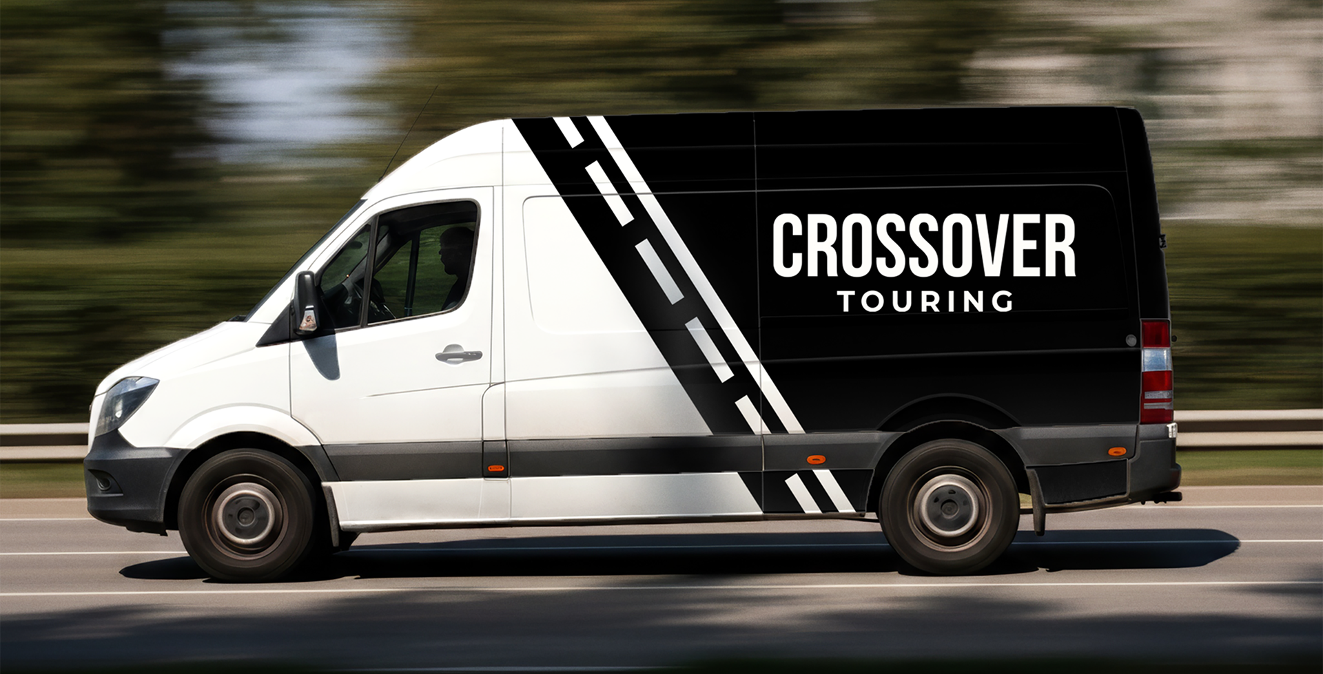
The final result was a complete brand system that gave Crossover Touring a consistent look across merchandise, crew credentials, and marketing materials. What started as a simple typed logo became a flexible identity designed for everyday use.