The Brief
This early-stage health-tech company needed a brand identity that could launch quietly without a public presence while still providing the founding team a complete visual system. The mark needed to communicate cognitive health and personal care in a category that often defaults to sterile, clinical design.
My Role
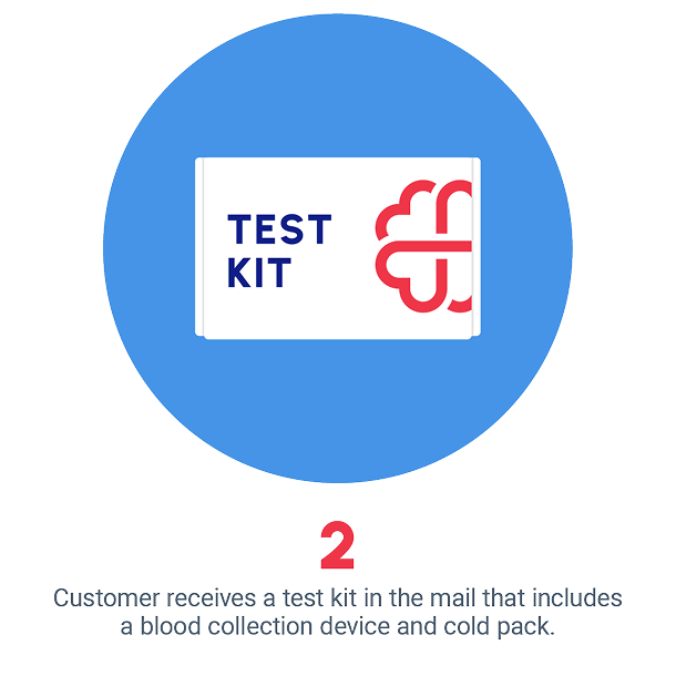
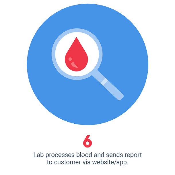
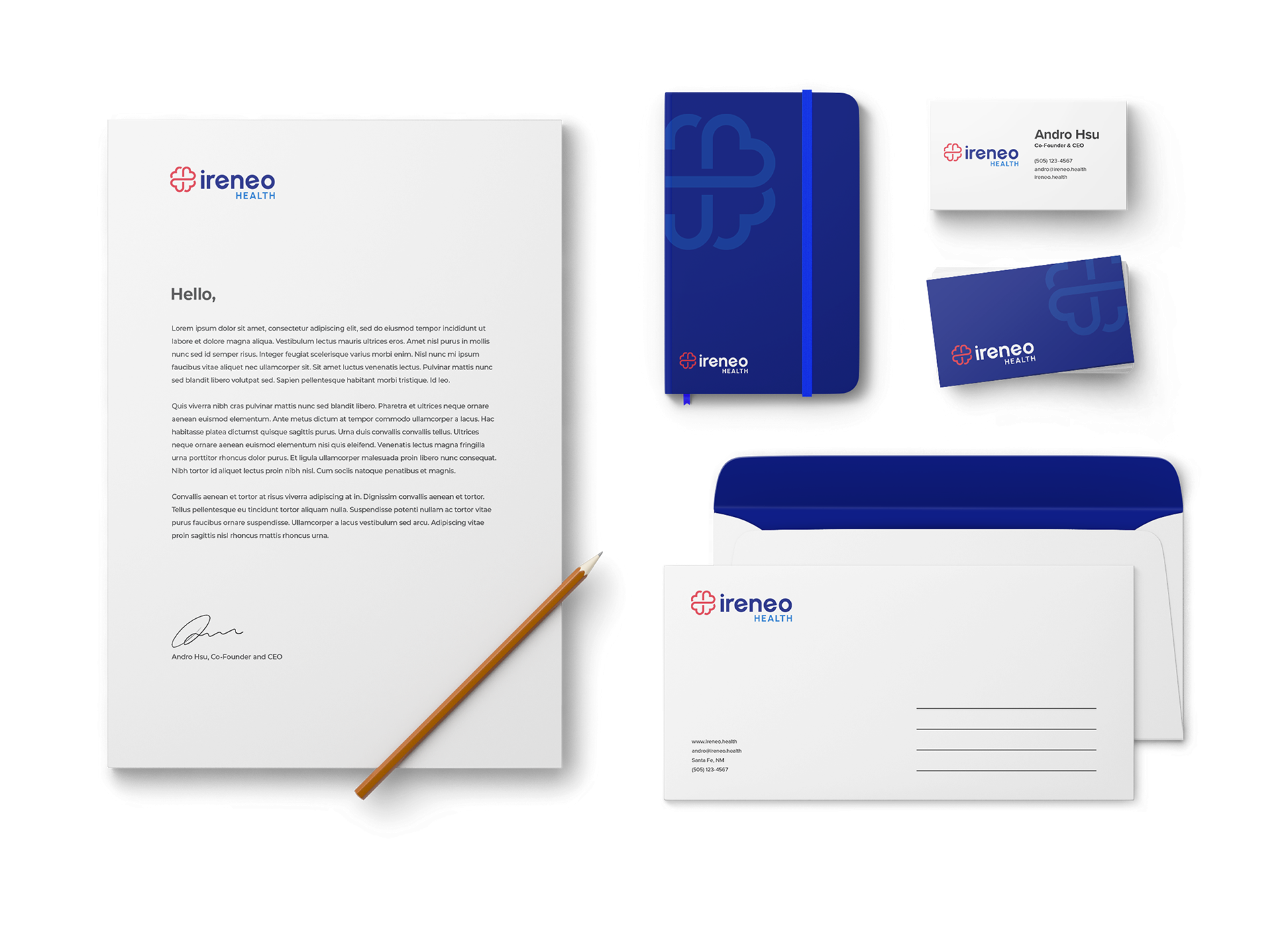
I designed the primary logo mark, a fused brain-and-heart symbol built into the negative space of a cross, along with color and typography systems. I extended the identity across business cards, letterhead, envelopes, and branded notebooks to provide the team a cohesive stationery suite ready for early partner and investor meetings. I also created product illustration icons to visually show how the product works.
The Challenge
Health-tech branding tends to skew too clinical or too soft. This brand needed to sit between credible enough for a medical product and warm enough for an at-home personal-care experience. The brain-and-heart mark had to read clearly at both icon scale and full lockup across a two-color system built on deep navy and warm red.
The Outcome
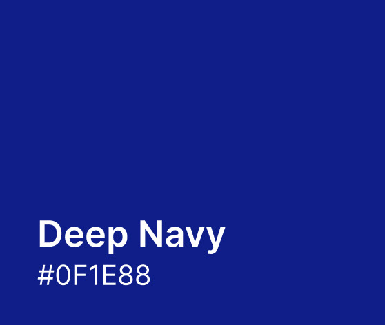
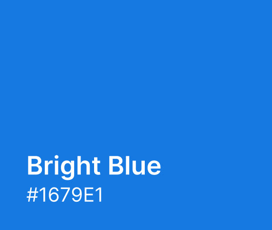
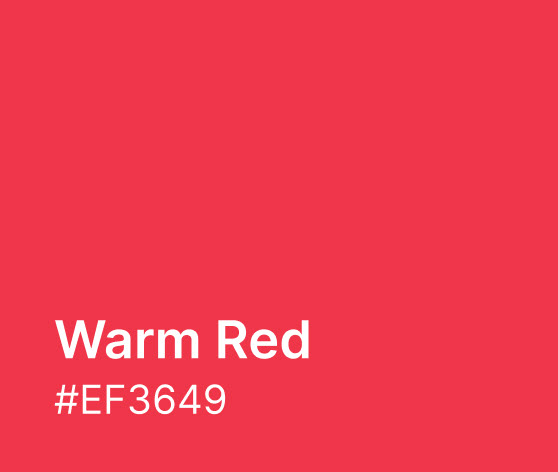
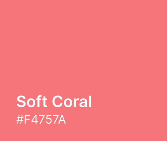
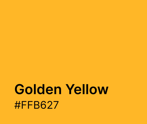
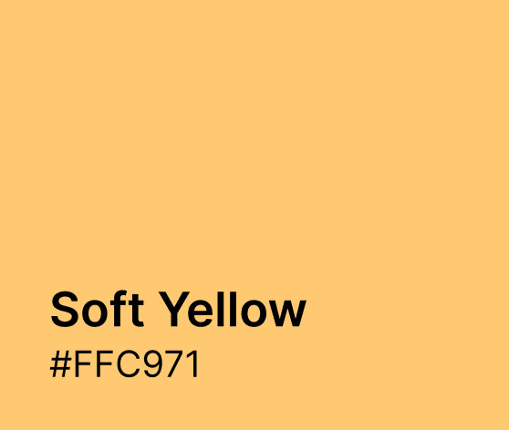
The result is a flexible identity system anchored by a single distinctive mark and a warm, confident color palette (deep navy, bright blue, warm red, coral, and gold). Applied across business cards, letterhead, and packaging, the brand gives this early-stage company a polished, cohesive presence for early conversations before a public launch.